


Thank you to Iron Orchid Designs for sponsoring today’s post. This post contains affiliate links. If you make a purchase through one of these links, I earn a very small commission at no additional cost to you.
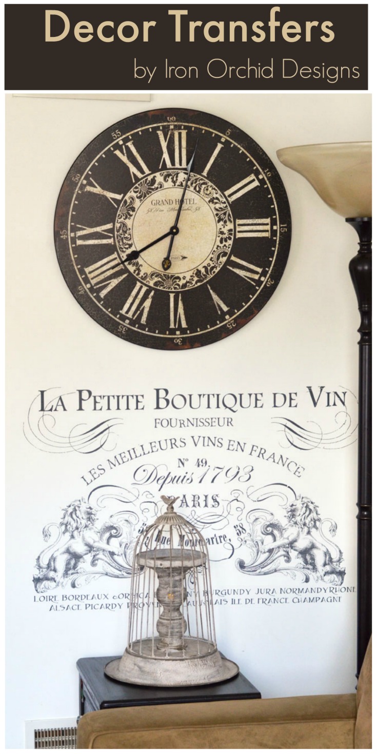
Pretty much every wall in my family room is covered with stuff. Whether it’s a photo gallery wall, artwork, DIY wall art, and clocks, there’s not much bare space. But believe it or not I found a bare spot for a very cool, french-inspired rub on transfer by Iron Orchid Designs. Take a look:
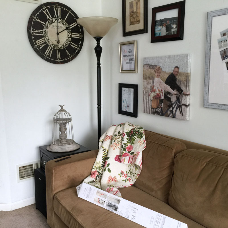
Right there . . . see it???
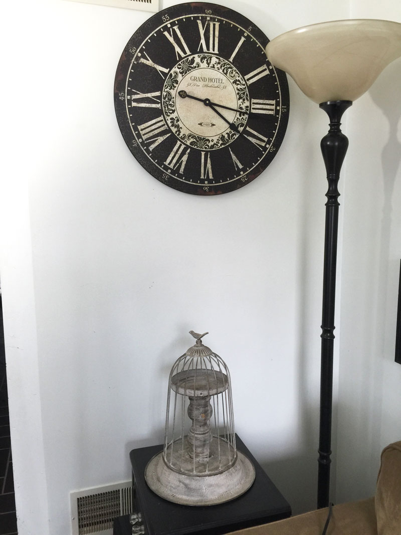
That bare space above the bird cage and the clock.
It needs something, right??? As it turns out the new Iron Orchid Designs Transfer that I recently received is perfect for this space.
By the way, you can find lots of the Iron Orchid Design Transfers on Amazon.
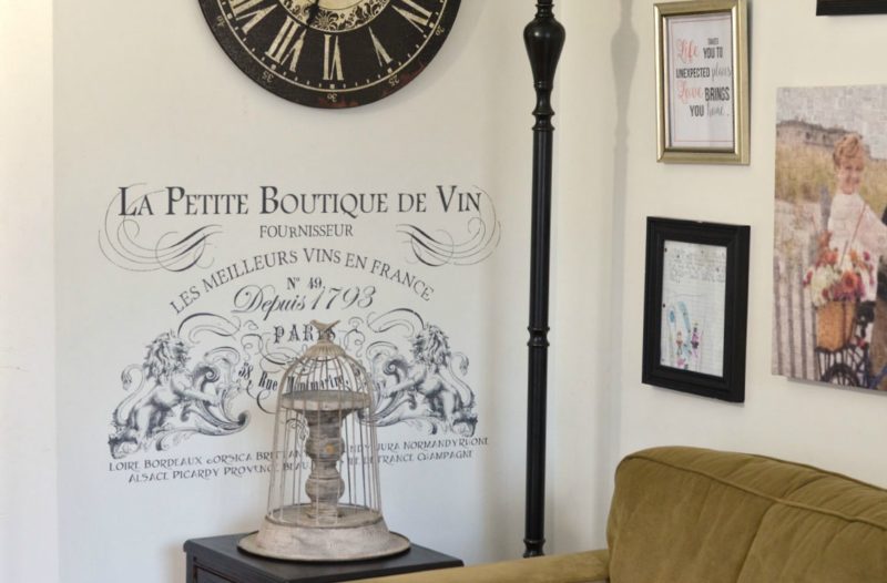
See what I mean? So much better!
Applying the transfer to the wall was very easy. Let me show you how I did it.
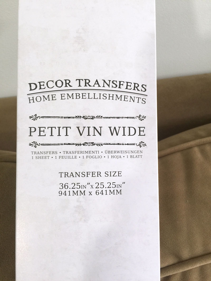
The transfer comes rolled up in a nice box like the one above.
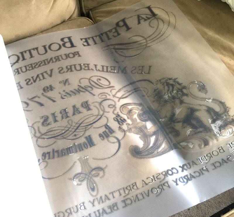
I took it out of the box and unrolled it. As you can see, there are essentially three layers: the white backing paper, the actual transfer material that stays on your surface, and the plastic or vinyl transfer sheet that the transfer is attached to.
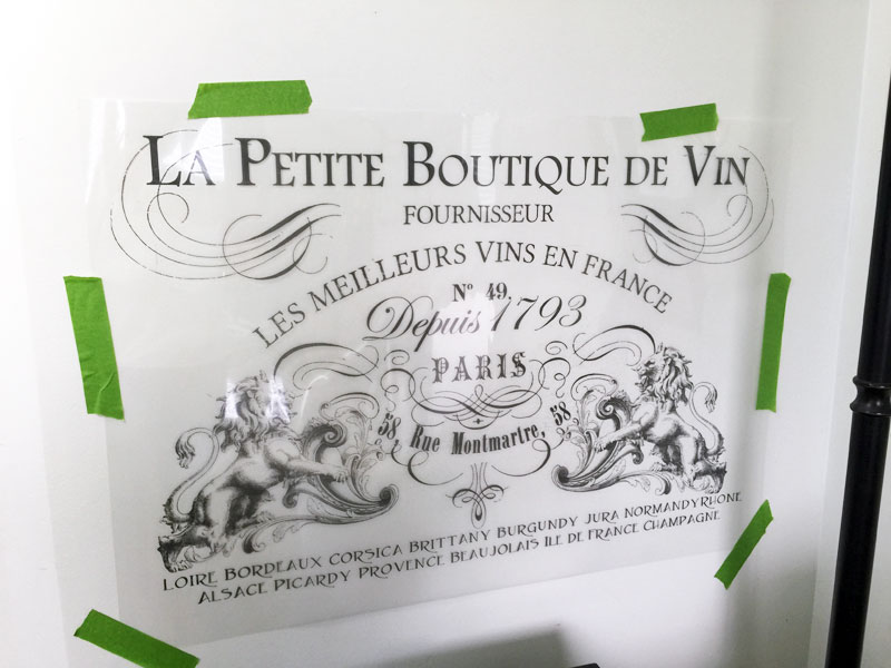
I removed the white backing paper and then taped the transfer sheet to the wall with painter’s tape.
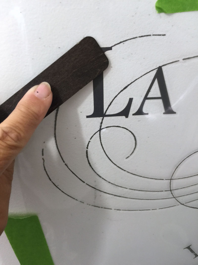
Using the stick that came with the transfer, I rubbed over the design until it stuck to the wall. I worked in small sections at a time and found it made things a little easier to cut away the backing from the area that had already transferred to the wall.
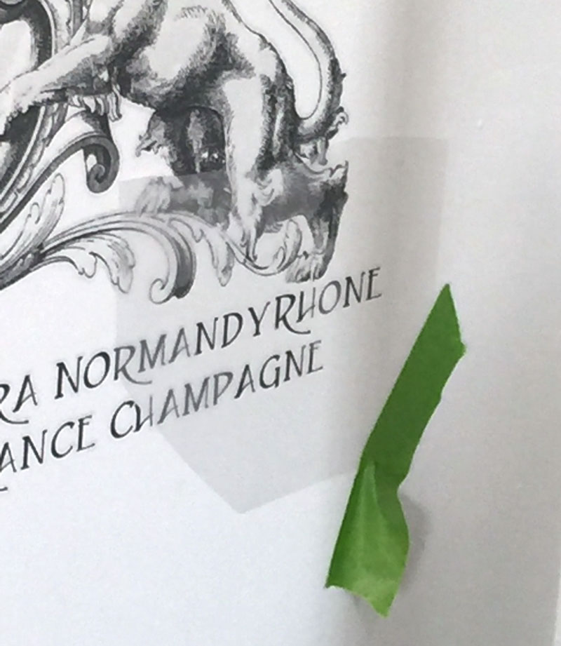
You can see by the image above that by this point I was almost done. (Just that last bottom corner has the transfer material still attached.)
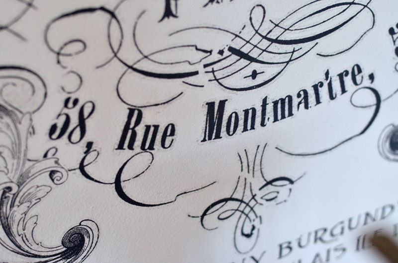
Here’s a funny thing that my husband noticed first. See that address on the transfer?
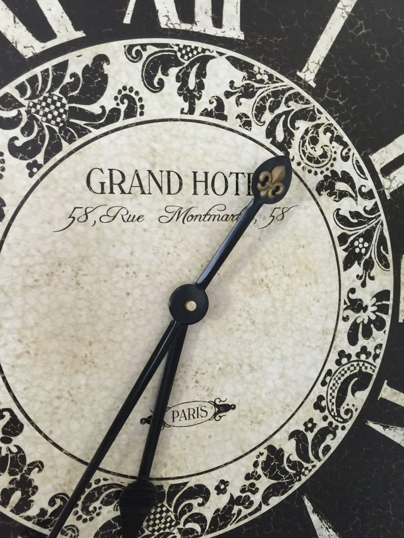
It’s the same that’s on my clock! My husband googled that address in Paris because we figured it must be significant. All he could find was a shoe store. I wonder what it was before it became a shoe store. Do you happen to know the significance of that address? If so, please let us know in the comment section!
I loved how quick and easy this transfer was to apply to the wall and what a big impact it makes for not a lot of money! Now that’s my kind of DIY home decor project!
These transfers can also be cut apart and applied to furniture. Like the one I used, I could have cut that horizontally into three or four strips and placed the designs on the drawer fronts of an old painted dresser. How pretty would that be!
Please visit Josie and Sally, the ladies behind Iron Orchid Designs to see all of their wonderful products!


Wow Jeanie! That is sooo pretty! I’m amazed that the address matches your clock. How fun is that!
Rub on decor transfers are going to change home decor!
gail
This is really awesome.! Congrats! I’m most definitely going to give those Iron Orchid transfers a try soon.
Now, I’m not French, I’m Mexican but I have the fortune to have been many times in Paris. While we wait for someone that can tell more about your beautiful clock, I can say that there is not a Grand Hotel in the 18th district and probably not a 58 Rue (street) Montmartre in Paris either. Montmartre is a high and beautiful district in Paris where The Basilica (special church) of the Sacred Heart, known in French as Sacré-Cœur Basilica, sits right on top of the hill. Montmartre is one of those magically special places we all should visit at least once in our life time.
Hi I want to apply a transfer to a wall above the bed in a bedroom. Will the transfer on the wall be just the black transfer on the wall or does it leave any other transfer colour on the wall like white? I think I am asking when it is done and you look at it will it just be my coloured wall with the transfer on it or will there be any other residue left? thank you.
I love how this Rub On Transfer by Iron Orchid Designs adds a creative touch! Have you tried incorporating these designs into your DIY projects? I’m curious to see what you’ve created! moto x3m
https://f168slot.com/ hôm bữa mình thấy bạn bè nhắc thoáng qua nên cũng bấm vào xem thử giao diện thế nào. Mình không có tìm hiểu sâu nội dung bên trong, chỉ lướt vài phút để coi cách họ sắp xếp trang cho dễ nhìn không. Ấn tượng đầu là bố cục khá gọn, các mục được gom theo nhóm nên nhìn qua là biết mình đang ở đâu, không kiểu nhồi chữ tùm lum. Mình thích mấy khối thông tin hiển thị dạng ô rõ ràng, kéo xuống vẫn theo dõi được mà không bị rối mắt. Thanh menu để chỗ dễ thấy nên chuyển qua lại giữa các phần cũng nhanh, không phải mò nhiều, và các bảng thông tin trình bày theo cột nhìn khá sạch sẽ. Nói chung chỉ lướt nhẹ thôi mà thấy họ chia khối nội dung và đặt menu khá hợp lý, nhìn vào là hiểu ngay bố cục trang.
https://nohu.fast/ mình lướt thử vì thấy vài người nhắc, chủ yếu tò mò xem họ sắp xếp trang kiểu gì thôi. Vào cái là thấy phần tiêu đề/heading khá rõ ràng, kiểu nhấn mạnh câu chuyện “Nổ Hũ” và mốc thời gian hành trình từ 2022 lên Top 10 năm 2025 nên đọc lướt cũng nắm được ý chính. Mình không đào sâu trò nào, chỉ để ý cách họ trình bày thông tin: các đoạn giới thiệu chia theo khối, có mục kiểu “giới thiệu thương hiệu 2026” đặt riêng nên không bị dính thành một bài dài khó theo. Menu với các mục chính nằm chỗ dễ nhìn, cuộn xuống là gặp các box nội dung tách bạch, nhìn khá gọn mắt nhờ các heading lớn và đoạn văn chia nhịp rõ.